
For those of you on a Windows XP machine, there is a way to increase readability of text on your screen by 10-15%. Microsoft has introduced what they are calling ClearType to their operating system. Apple has been using a similar technology since 1976, but Microsoft has just finally caught on.
What it basically does is make the font smoother and easier to read. Turning it on is simple.
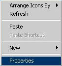
1. Right click on the desktop and select Properties.
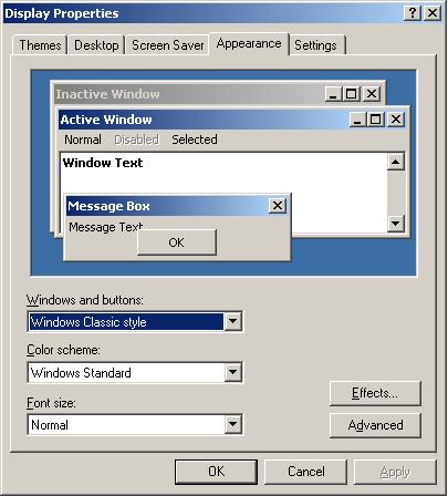
2. Select the Appearance tab and press the Effects… button.
3. Click the checkbox next to the words “Use the following method to smooth edges of screen fonts” and select “ClearType” from the dropdown field.
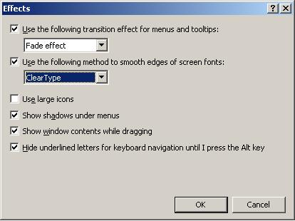
4. Finally, close the Effects dialog by clicking OK and click Apply to complete the process.
How helpful is it really?
I have ClearType turned on with my home machines for the wife and myself. The difference is very subtle, but does make a difference. Reading is easier and our eyes hurt less after staring at the screen for long periods of time.
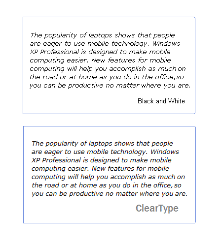
A sample of side-by-side text can be seen below.
Usability guru, Jakob Nielson, put the whole thing in perspective by estimated that someone on a $50,000 salary can save themselves approximately $2000 a year by turning on ClearType.
More information on how it works and other random facts can be found on Microsoft’s site.